Encosta do Vale Galego:
Winery Rebrand
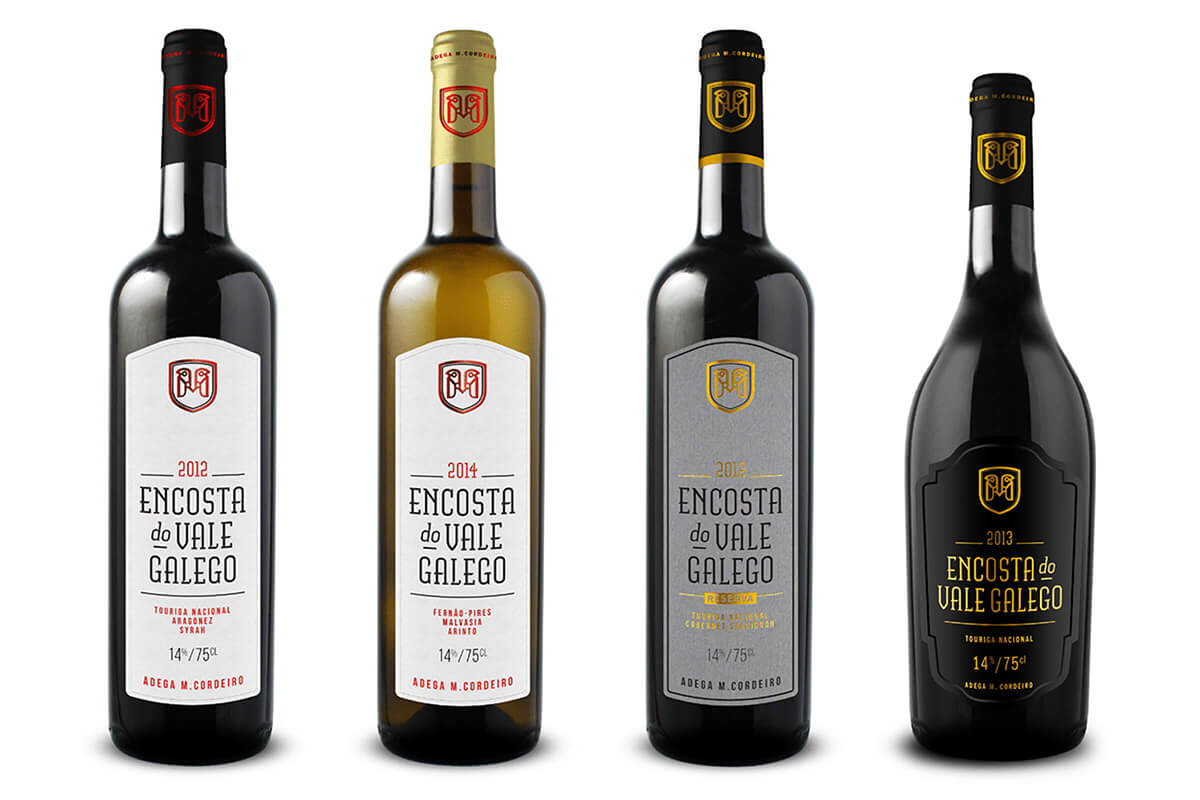
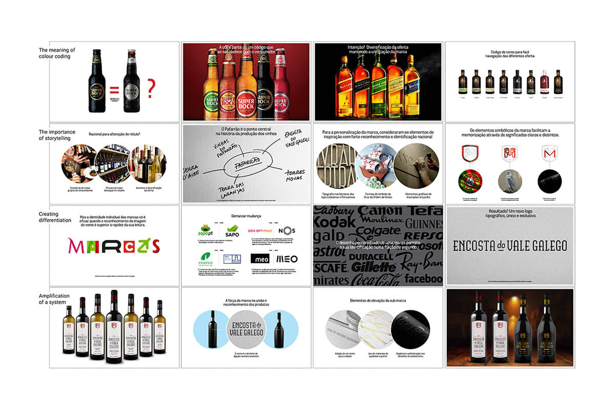
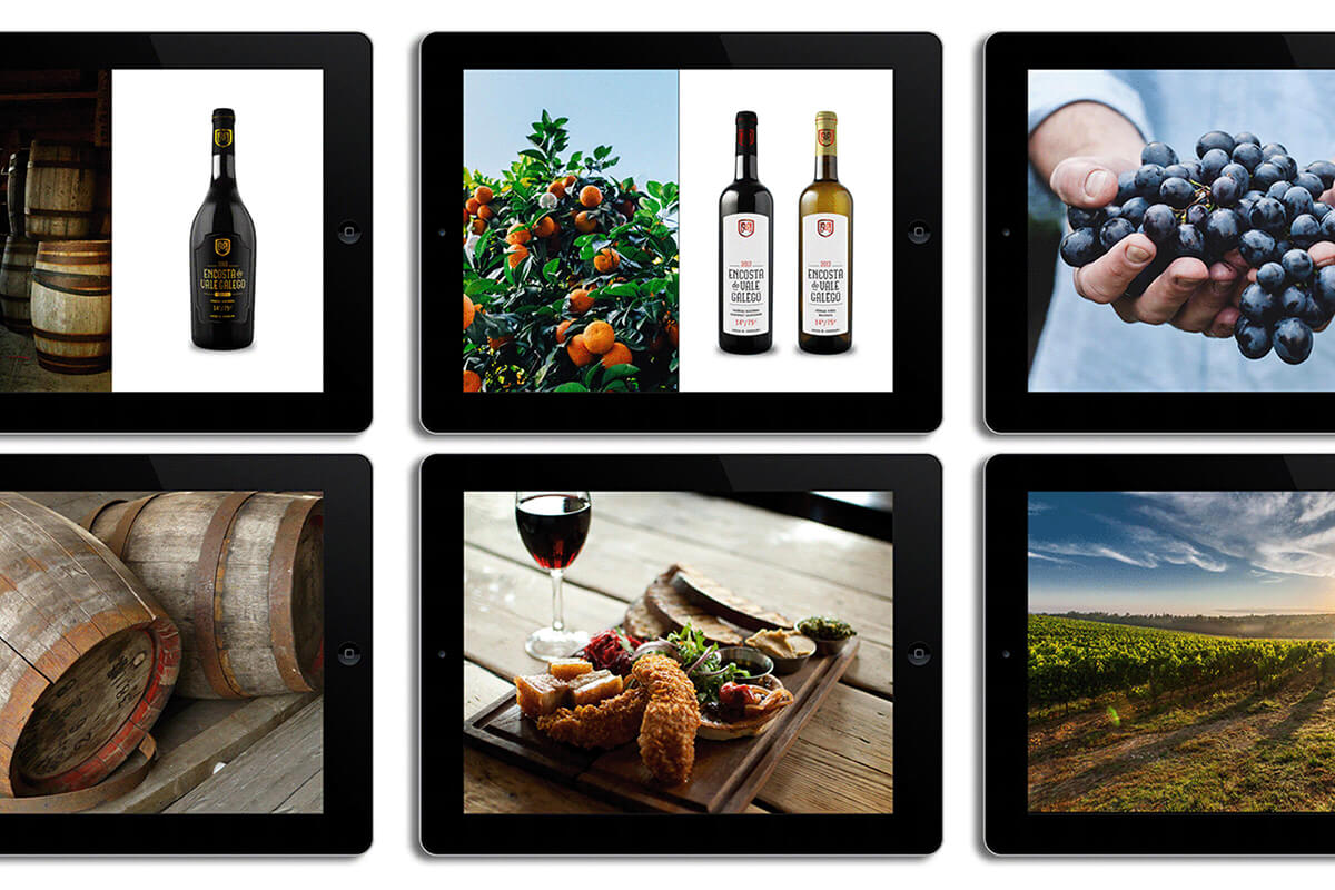
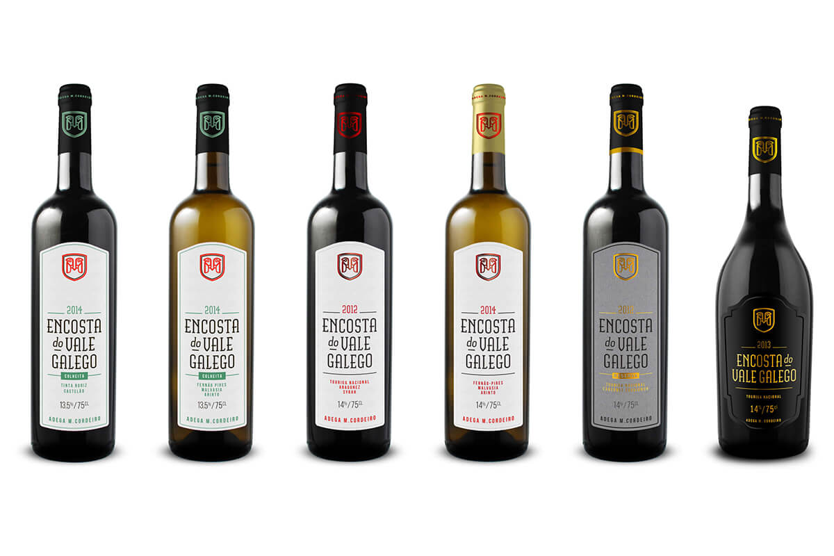
Encosta do Vale Galego is a small family business that has been gaining international recognition since it started around 2006. The Portuguese award-winning wine brand wanted to attract new consumers and diversify their offer under one unified visual identity.
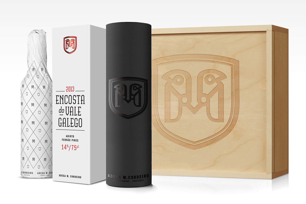
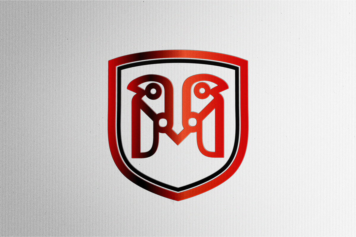
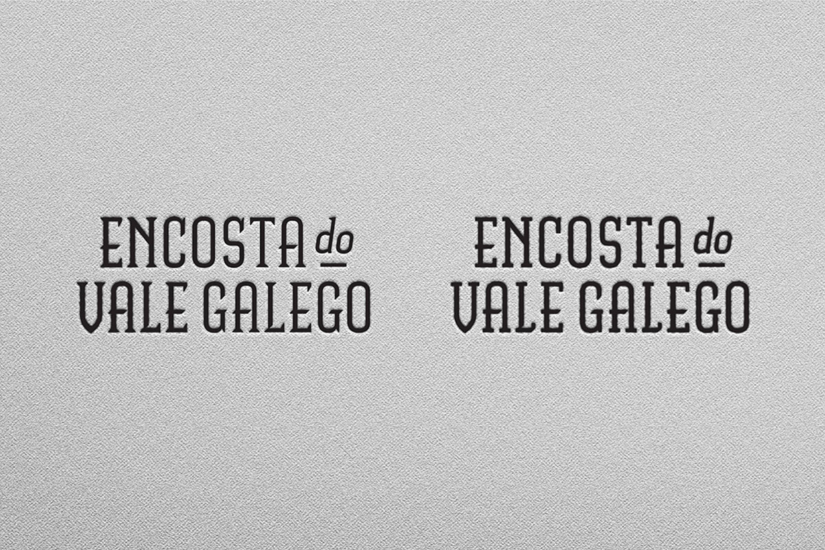
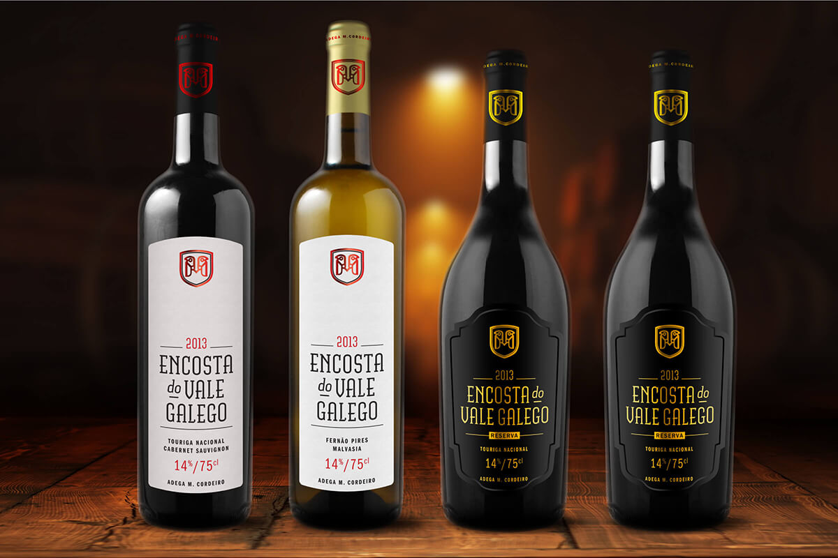
The new visual identity has two core elements — the winery crest and the wine wordmark — which carry references about the history and location of the vineyards. One can also easily recognise the two falcons facing each other, forming the letter "M", the founder's name initial.
The simplicity of the new label display those two elements in a confident way, making them easily recognisable and consequently memorable.
